Bloggo Science ~ A Hypothetical Post
One of the, well-deserved, knocks on Ancel Keys is his cherry-picking of evidence. A little while back Chris Masterjohn posted a bit of an admonishment to those who might fall prey to Keys' error. In that post Chris presented the "evidence" of Keys' cherry picking from Uffe Ravnskov's The Cholesterol Myths.
In the interest of full disclosure, I've never really bought into cholesterol scares and I can't really tell you why. My folks had a number of nutrition books in our home growing up and my maternal grandfather was a bit of a "health nut" so I picked it up from here or there. Thus, the dietary fat type issue per se or LDL hysteria was never much of an interest to me and I've not done a lot of recent reading/research in that regard. I'm not well versed in Ancel Keys' work though the cherry picking is legendary. However, I was a bit surprised to read the following in Chris' post:
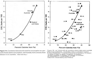
"Keys had presented data from six countries, purporting to show a clear linear relationship between the amount of fat consumed in a country and its incidence of heart disease. This graph is shown on the left below. The one problem was that data was available for 22 countries at the time, and including that data demolished the relationship."
I would hardly say that adding the scatter to that curve "demolishes" the relationship. Does anyone know if a regression on all 22 countries has been done? Pardon me if I'm asking the obvious from some well known blog or treatise on this. As I've said, it's not something I'm all that intimately familiar with. Still, I see a clear positive relationship, it's just not nearly as definitively "perfect" for the line Keys drew.
So ...
Imagine, dear readers, that yours truly discussed a small hair growth study involving a dozen participants. To further complicate matters, the amount of hair growth reported was for similar durations but duration did vary. Subject 1's growth was assessed at 20 weeks while subject 2's at 22 weeks and 5 days ... that sort of thing.
What would you think of my analysis of said study were I to say something like:
I played around with the numbers and noticed that if I looked at just results of the half of the participants with dark hair, a pretty convincing positive correlation between initial hair length and total growth could be shown. If I include the light haired participants, however, this correlation is falls apart. But I'm going to go ahead anyway, and use half the data make the case that a commonly held notion that hair growth is greater for shorter hair than longer hair is debunked by this well designed study.
This is a rhetorical question, of course. I would hope you would think I'd gone over to the science bloggo darkside with such an analysis, although I'd love to hear how someone would defend this! Ahh but you get curious and are armed with the raw data from the study ... it's not that many numbers since it was such a small study, so you put them into a spreadsheet in between checking FB while nobody's watching at work. It's a simple spreadsheet, for a dozen participants you have initial length, final length and time elapsed between measurements.
The first thing you find is that I told the truth. The dark haired group presents a rather convincing graphic. Add in the light haired participants and your scatter plot of total growth vs. initial hair length turns to a wash. But it is also curious that there's almost faint support for what I've debunked looking just at the light haired group!
Next, you think, heck, with different time periods, total growth is misleading, let's look at the rate, say growth/week, instead. You find that even for the dark haired group, where my graphic was so convincing in support my debunking, the plot of growth rate v. length already becomes a wash.
Ultimately you say, jehosephat!, let's look at the whole lot and see what we have for length vs. growth rate. Hmmmm.... perhaps not statistically significant, this we would have to test, but a trend in favor of the hypothesis I "debunked" with my cherry-picking.
Does CarbSane survive as a credible voice?? If you blog on my analysis and expose the swiss cheese science, will you be embraced?
{tease}
Comments
;)
You can see the graph much better on Chris' page. Note that each of the six countries from the first graph is plotted twice on the second graph. (Noting full well as you also say that Chris did not make the graph.)
Take the case of Japan. It is plotted as 'Japan' and also as 13. The points are close to each other but do not coincide in each of the six cases. Same country, different years? Or just very inaccurate graph-making by somebody?
I also believe that the relationship is not demolished. It does not look like a random scatter plot at all. The upper left quadrant, low fat and high death, has no points that are solidly inside it aside from the Israeli paradox. In the lower left quadrant, low fat and low death, there are lots of points.
As for myself, I'd suppose that the association is really about low calories (and leanness), not necessarily low fat. But still the graph is not random and I think it is useful.
A graph could be nicely linear if there were only one factor causing the CHD deaths. But let's not forget that there are two major components involved in heart attacks: you need the atherosclerotic plaque formation, and then in most cases (about 85%) you need the plaque rupture (or erosion) to cause the fatal thrombosis. Rupture is very dependent on inflammation which breaks down the fibrous cap, via the Matrix MetalloProteinases excreted by inflammatory macrophages.
So the Israeli paradox, if due to their high use of pro-inflammatory soybean oil PUFA, would shift their point upward higher than it would have otherwise been. In fact, the vertical distribution of the countries not in the lower left quadrant might have a lot to do with inflammatory status. Inflammation might be the second major factor that determines a point's position.
I had made my own version by erasing the line and plotting by eye. It was similar, but bowed more to the right so that it becomes rather vertical in the upper right quadrant. I'd guess that there must be software that would plot the line automatically.
Returning to Japan, there in the lower left, it should be stressed that is the point that most "demolishes" the theories of Taubes. The majority of their calories came from rice, the dreaded 'processed' kind, and yet for generations they were not fat and didn't have much CHD. They did start to get fat and have higher rates of CHD (and diabetes) once they started eating high calories in the form of tasty high-caloric-density foods. Somehow all of that gets glossed over time after time after time, while people get lost in useless arguing about mechanisms and foolish theories.
I do not think anybody denied that the data showed a correlation between saturated fat consumption and heard disease. However, apart from the fact that Keys only showed data for six countries, which made the correlation look stronger than it really was, the other main complaint was that Keys ignored confounders and focused only on fat intake. This, for example, was the criticism of John Yudkin.
Anthony Colpo, in his book, "The Great Colesterol Con" notes: John Yudkin, using data from 15 countries, found in 1957 that animal fats association with CHD was weaker than total fat. Out of all dietary factors, sugar consumption had the strongest association with CHD, but that the strongest predictor was the level of TV and radio ownership followed by car ownership. Yudkin noted that CHD appeared to be a disease of affluence, increasing with rising per capita income. He also noted that affluent countries tended to have higher per capita total calorie intakes, a phenomenon that served to amplify the negative effects of physical inactivity. [p. 39]
Just be be clear, I believe this was a different data set than what Keys used.
--Larry
Some of us less subtle testosterone types may have caught "blogzarro world science" sooner
Yes, the additional points at least bend if not break the theory that the relationship is linear, but there clearly is an association - with the added points it looks completely nonlinear, like the bottom right quadrant of a circle.
Sorry to be a tease here guys, but the data I'm referring to in my little hypothetical is not Keys' data and I'm not taking any issues with Chris other than I don't agree that when you add in the "ignored" data the relationship is demolished. With that many data points in that type of study, it's pretty good!
Point taken Larry about the confounders, again wasn't trying to say anything about those charts and I think Larry & Lerner hit on the calories that I believe tend to be the real issue.
Sanjeev the "best fit curve" would probably be a quadratic or exponential. What the significance of that would be is ??
If it's calories it sort of shows that it is difficult to consume high energy with low fat consumption.
The 22 countries graph is from the paper published by Yerushalmy and Hilleboe in 1957 [1], in response to Ancel Keys' publication. I don't have their paper, but apparently they did the math and the correlation disappeared or lost statistical significance when all 22 countries were included.
The only clearer version of the original I could find online appeared in an article by Gary Springer. Just scroll down a little for the graph, which also has a line added by Springer, in case you would cherry pick Finland, Italy, Ireland, Switzerland, West Germany, and Holland.
Link: http://bit.ly/nBbJi4
"I would hardly say that adding the scatter to that curve "demolishes" the relationship"
I think you hit a very important point here: the scatter is added to the original curve. The apparent remaining relationship could well be the result of a subtle optical illusion created by including the curve. That curve causes a bias in the perception of the data points, and it's very hard to ignore.
Just check out an adapted version of the 22 countries graph that appeared in an article by Garth Lane, without the Ancel Keys line. From that image, the spread of the points seems way too big for me to consider this a meaningful correlation, given only 22 data points. If there were many more points, and most of the points were clustered along a line or curve with some scatter further away, it would be a different story. But that's not the case here.
Link: http://bit.ly/mWkaJL
John
References:
[1] Yerushalmy J, Hilleboe HE. Fat in the diet and mortality from heart disease; a methodologic note. N Y State J Med. 1957 Jul 15;57(14):2343-54. http://pmid.us/13441073
Still seems without the line there you've got a correlation. It is quite surprising sometimes how scattered a plot can rise to statistical significance.
For example, I was always used to r's of 0.99 for calibration curves used to determine plasma concentrations. When I first started teaching Stats I deliberately tried to create a set of data points that would not reach statistical significance by varying standards. I kept having to alter my data by what seemed like wild amounts!
From the looks of that, a linear regression will likely reach stat sig. I don't have the time to do that at the moment ... but maybe some day ... or perhaps Ned Kock has had a go at it??
http://bit.ly/dK0pFq
http://bit.ly/dAuAXC
Nope, I'm not Doug. I post only as Lerner, and I've avoided lo-carb sites for a while because I've come to see lo-carb as irrationally driven.
I actually did come here to suggest a topic for some future article: what would the end of Taubes' house of cards be like? After all, he doesn't have "Taubes Health Bars" for sale in every store like Atkins did. (I remember how years ago there suddenly were gigantic discounts on Atkins products as they were discontinued.) He does seemingly have defenders who are trying to alter his theories to fit reality, while never repudiating Taubes. That's like the cracks in a dike appearing. I also did see what's-his-name the famous blogger abandoning the wisdom of lo-carb and the supposed safety of high SFA. So, will the house of cards end with a bang or whimper? :)
And now some pretty bright people are forced to use the numerology of Glycemic Load to try and make it all work.
I don’t how much Taubes has really changed directions with the sugar talk. This is from a transcript of a recent interview with Mercola where Taubes was whining about starchy vegetables:
He [NIH bioethicist Zeke Emmanuel] was telling me like how much this My Plate was going to be this great success. It was going fight back obesity because fruits and vegetables were half the plate and this was a big change.
I feel like…how do I say it, but it’s still mostly carbohydrates and isn’t the potato a vegetable in America. And it is. It is a starchy vegetable. You could still end up with high glycemic index carbs as the bulk of your diet and you’re still going to make people fatter and not thinner.
I do think there might be something to sugar, but I don’t think it has anything to do with insulin. Just watching my children I wonder if it is purely a palatability issue. Children seem to be over-conditioned towards sugar with all the sugar being put in baby food and formula, and sugar can make a whole host of foods more palatable.
http://www.youtube.com/watch?v=NDwjkv1FW5g&list=PLCC2CA9893F2503B5&index=36&feature=plpp_video
Post a Comment
Comment Moderation is ON ... I will NOT be routinely reviewing or publishing comments at this time..